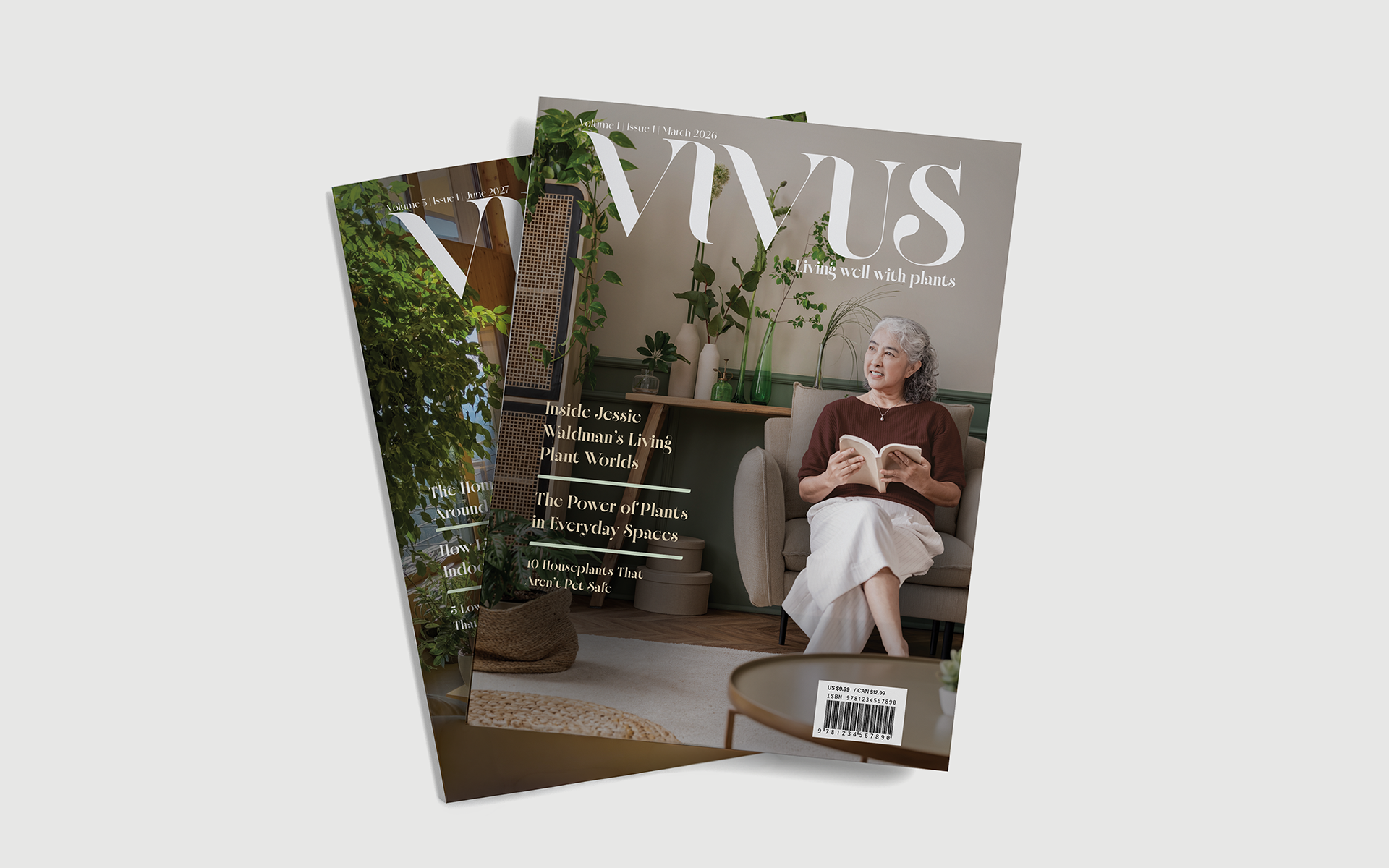
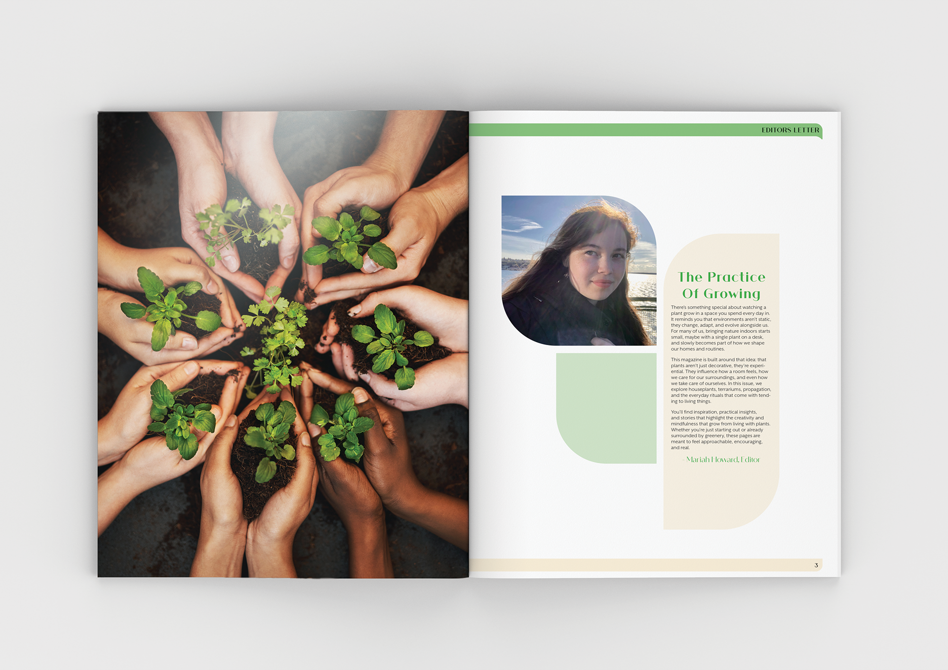
Vivus a plant lifestyle magazine, called for consistent branding to display their articles in an intriguing and visually appealing way that resembles a peaceful and nature focused voice. Thus, plant adjacent shapes and colors are used throughout the magazine. The shapes that were used were somewhat organic to depict the concept of nature and peace while remaining functional as elements assisting in layout.
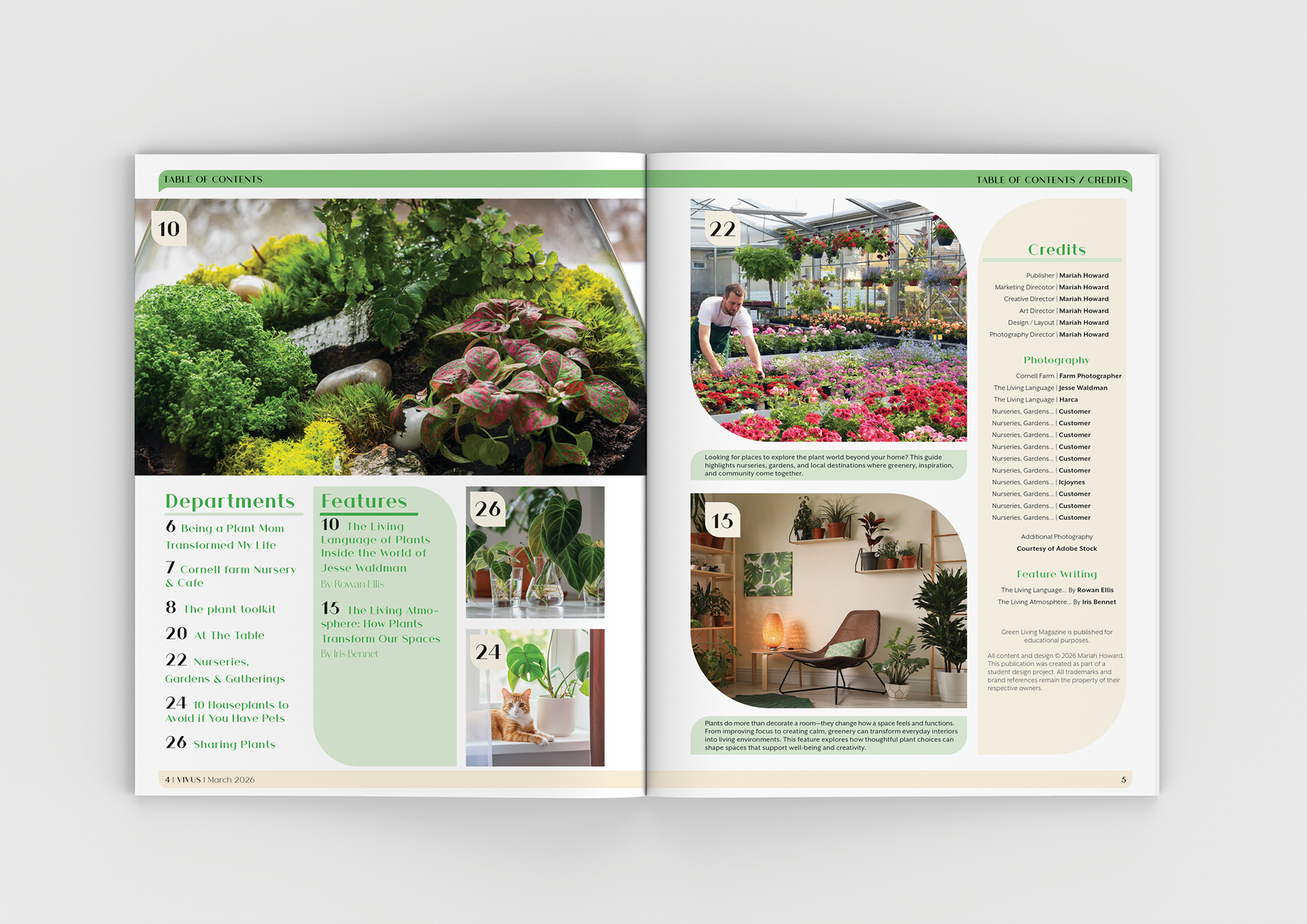
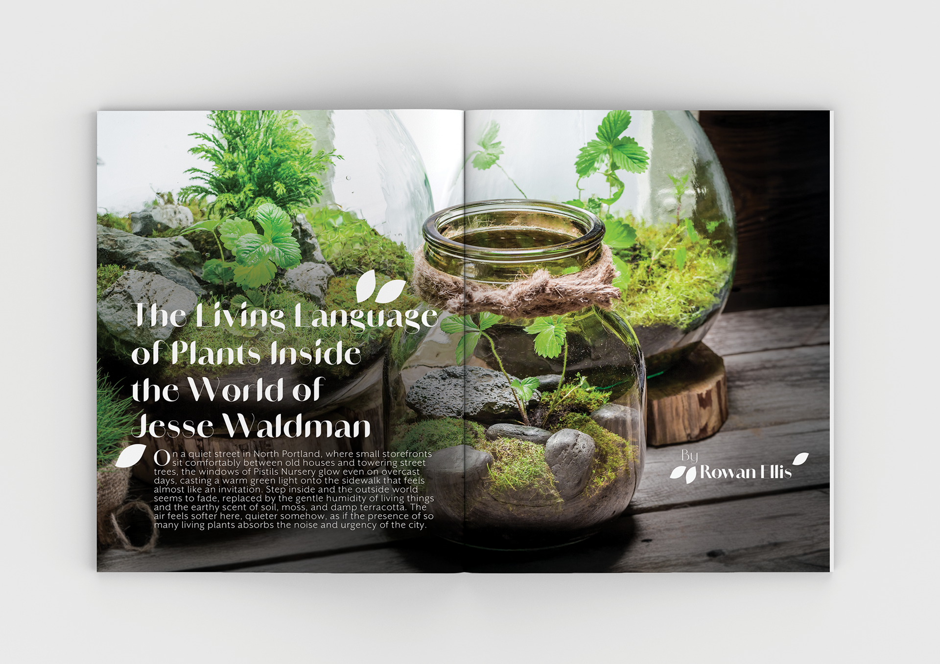
Vivus also had the priority of having two different features stand out from the rest of the magazine while resembling the contents. For the first feature a leafy shape was utilized to speak towards The Living Language of Plants Inside the World of Jesse Waldman. The second feature focuses on how plants affect living spaces thus a more simplistic, visually wide, and open organization was utilized.
8.5 inches x 11 inches