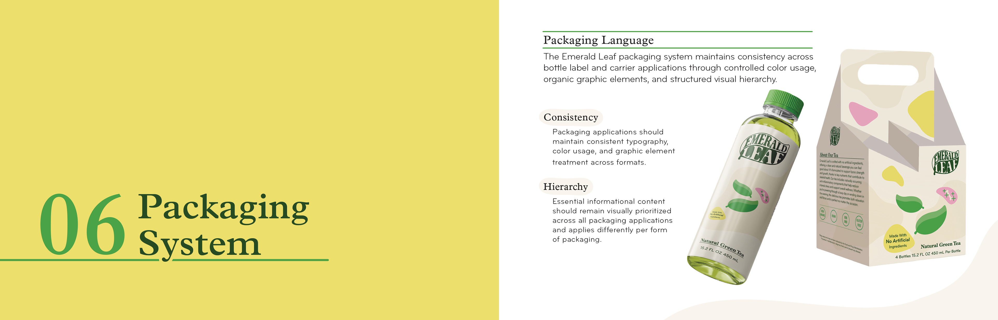
The design direction for Emerald Leaf emphasized the integration of organic background forms across the packaging of a bottle label and carrier, while ensuring essential informational content remained visually prioritized to maintain proper hierarchy and organization. Bold color use was limited in large background areas to reduce distraction and hierarchy division, while higher saturation tones were used selectively as accents to emphasize key information and create visual movement.
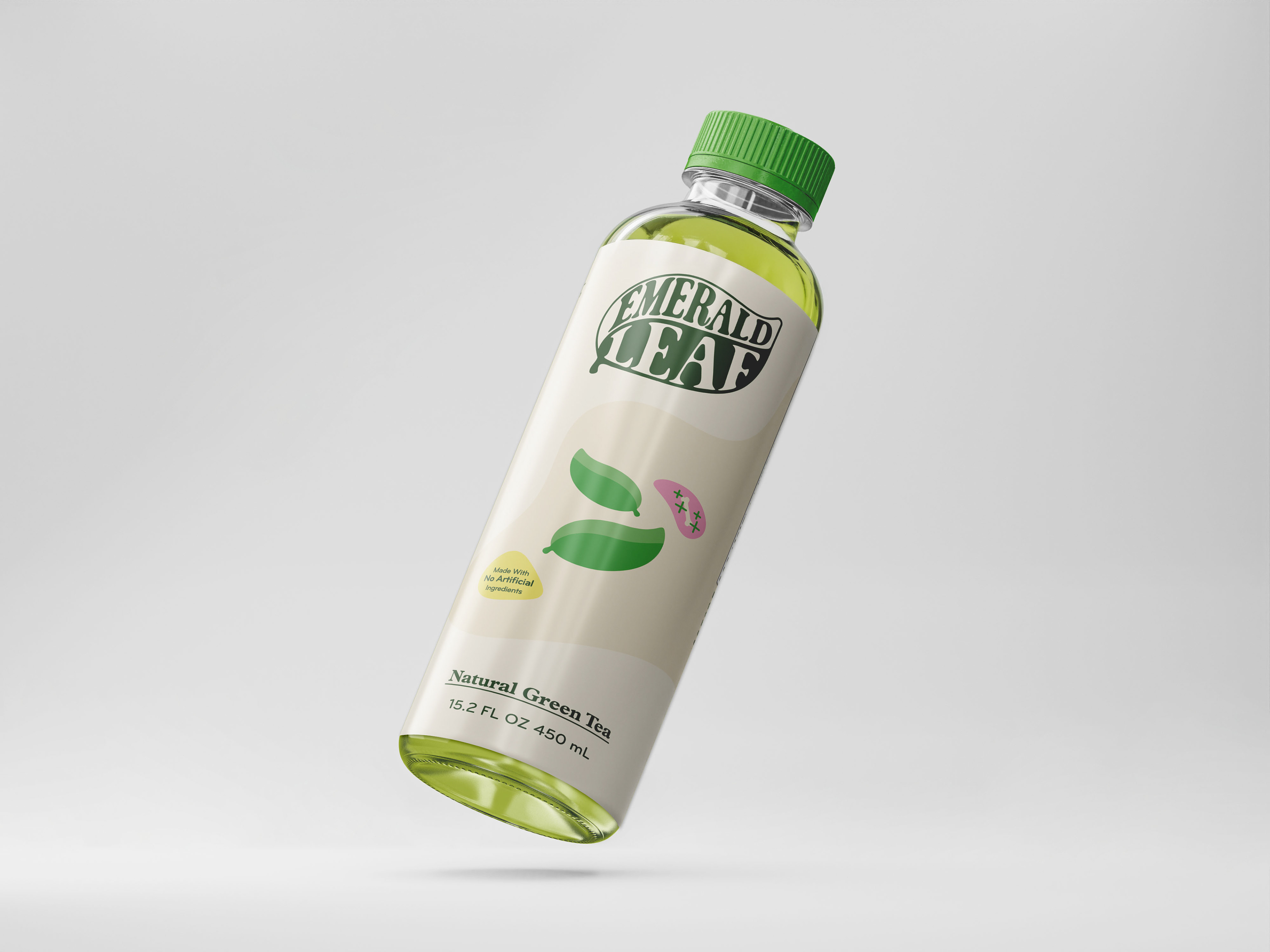
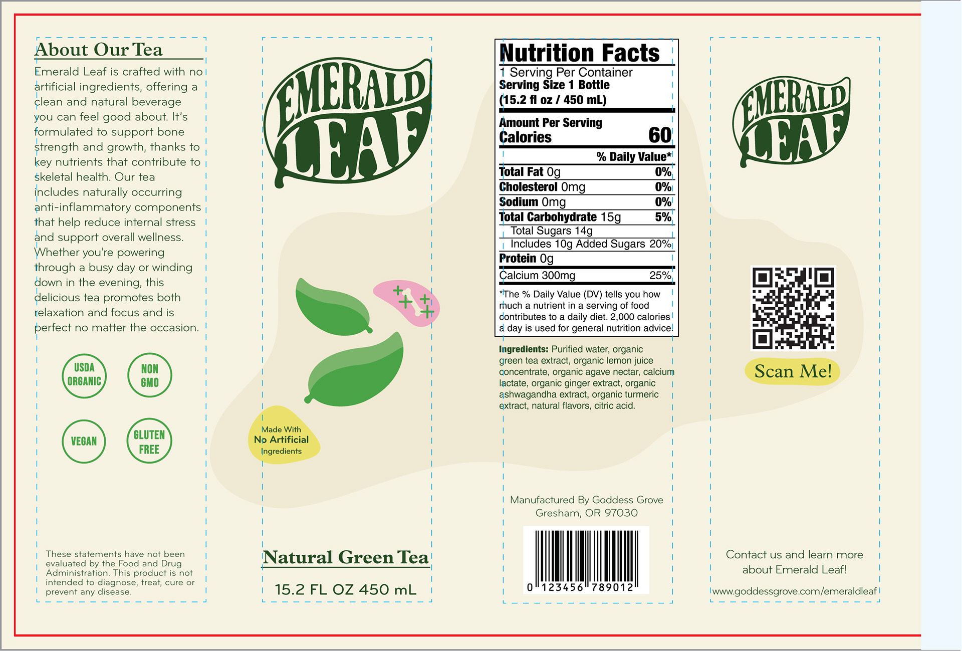
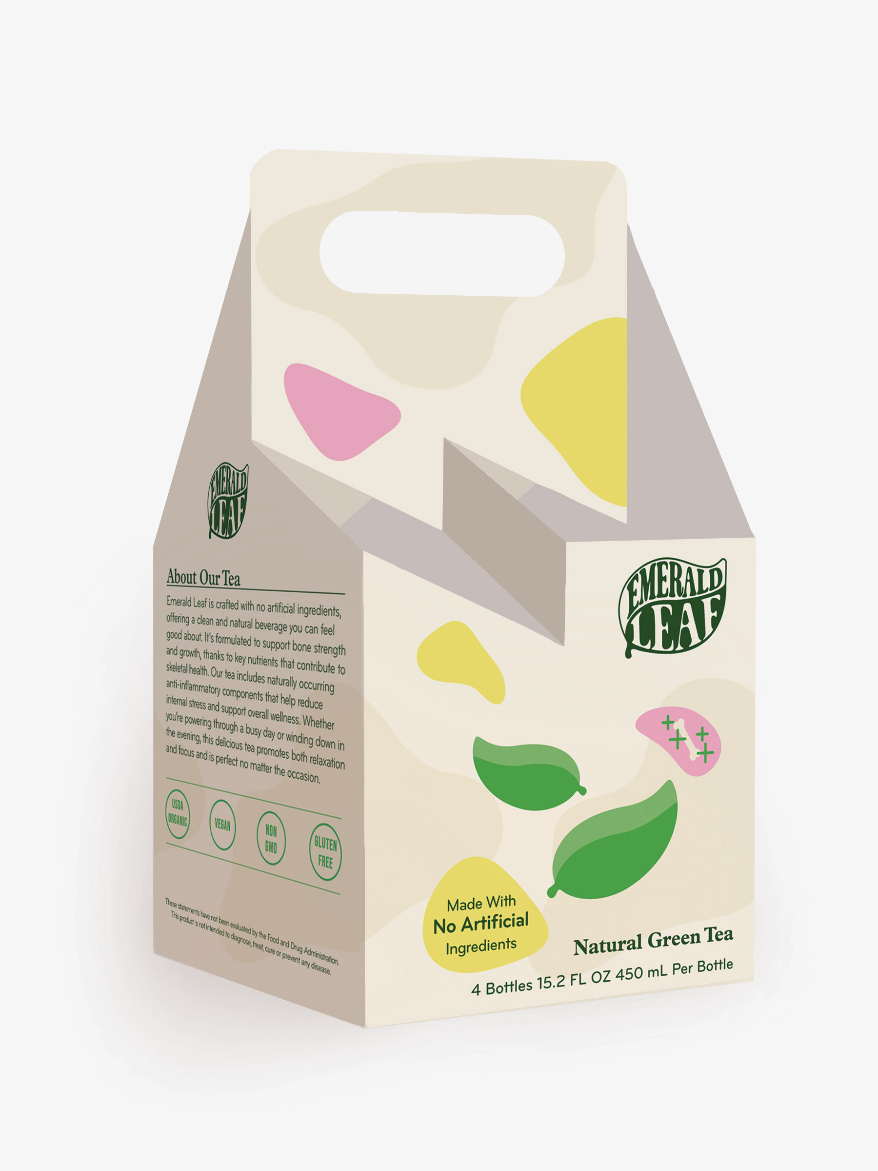
Bottle Label: 8.25 inches x 5.5 inches Bottle Carrier: 5 inches x 5 inches x 10 inches
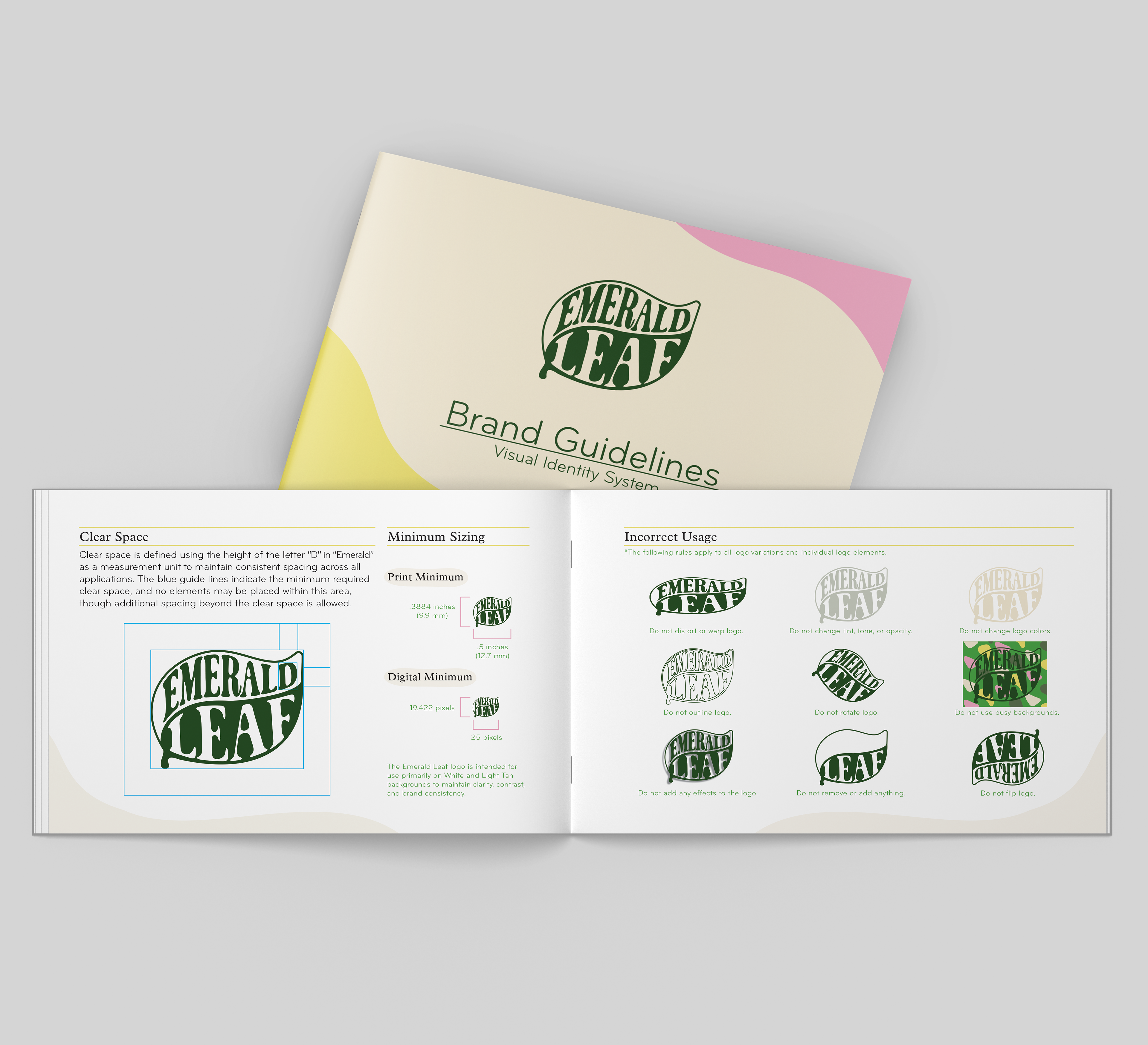
Emerald Leaf also required a structured handheld and portable identity system to maintain consistency across all expressions of the brand. To support quick reference and practical use during the design process, a compact booklet format was used to create an identity guide that remained easy to navigate, accessible during design execution, and efficient for maintaining consistent brand application.
7 inches x 4.5 inches
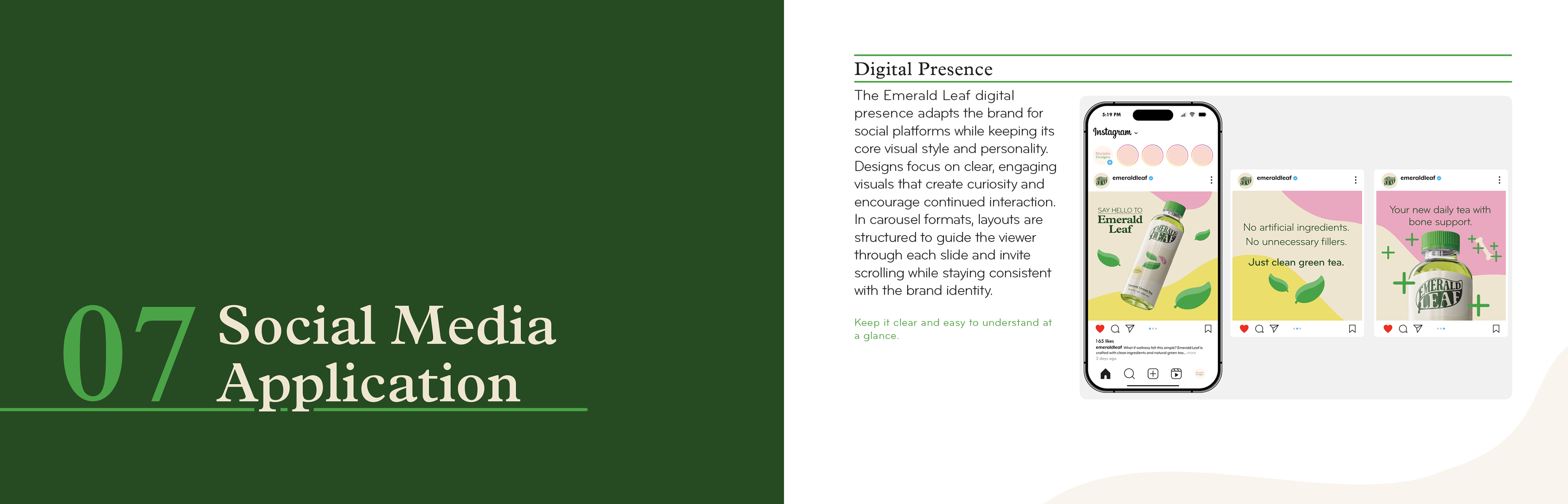
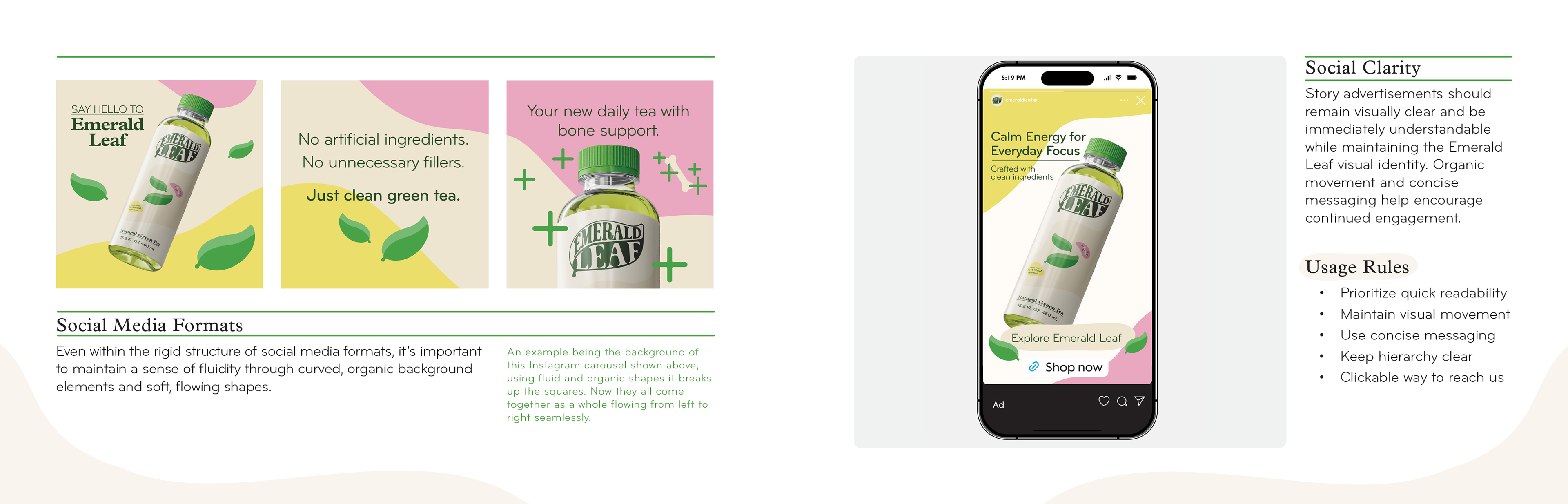
Emerald Leaf was also in need of social media applications that maintained smooth visual continuity across rigid, grid-based digital formats while preserving its organic and curved brand identity. Organic and directional graphic elements were used to guide visual movement, encourage continued interaction, and reduce the visual rigidity of structured social media layouts.
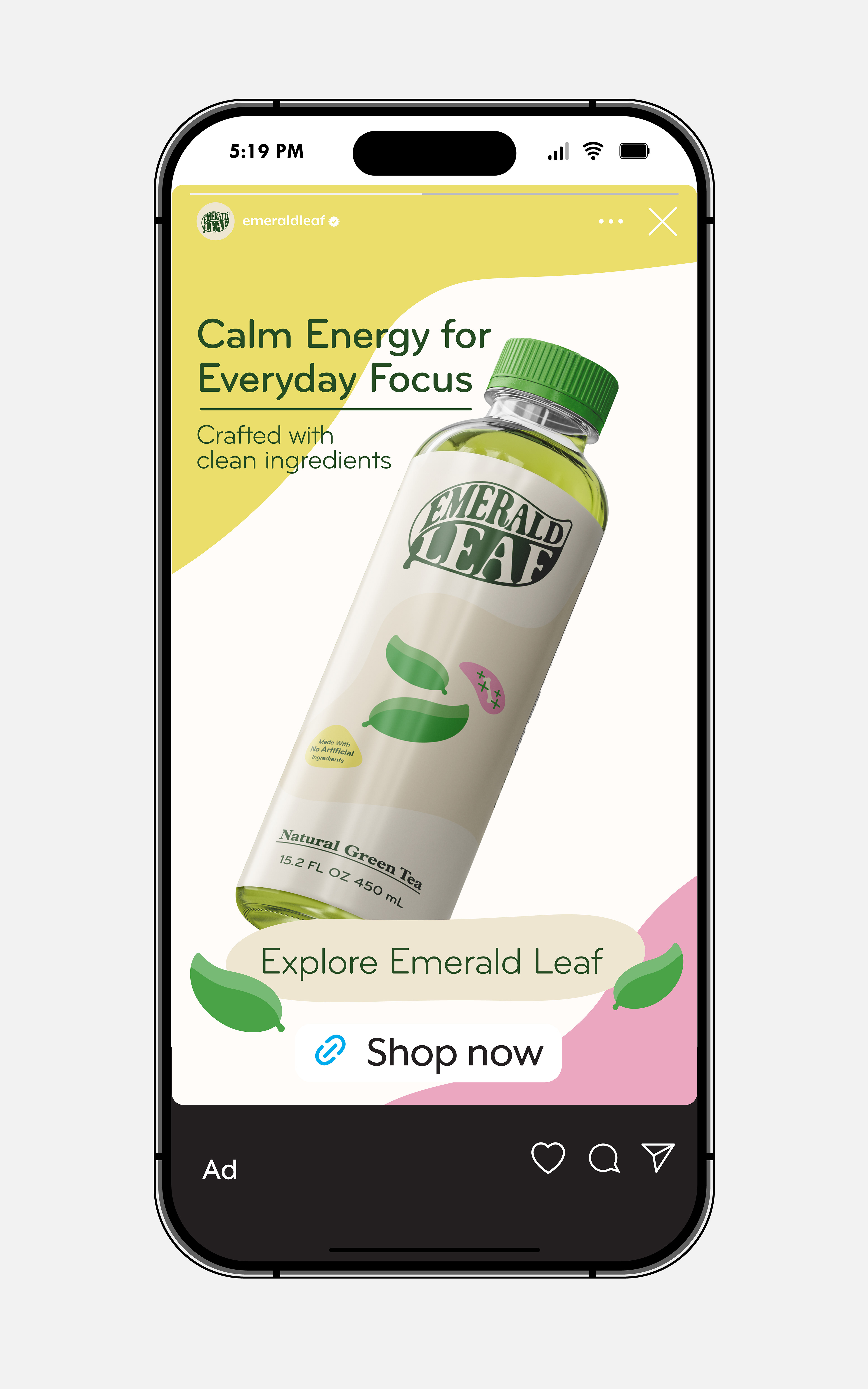
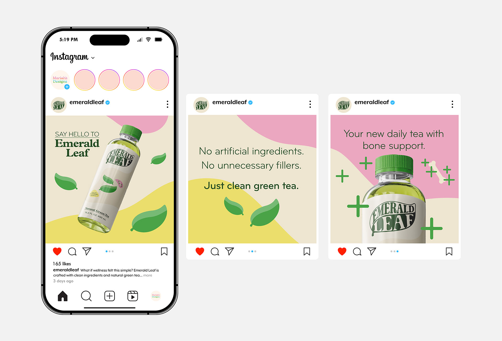
Advertisement: 1080 x 1920 pixels Carousel: 1080 x 1080 pixels